What is
the Australian Cancer Atlas?
The approximate reading time of this visual explainer is 15 minutes.


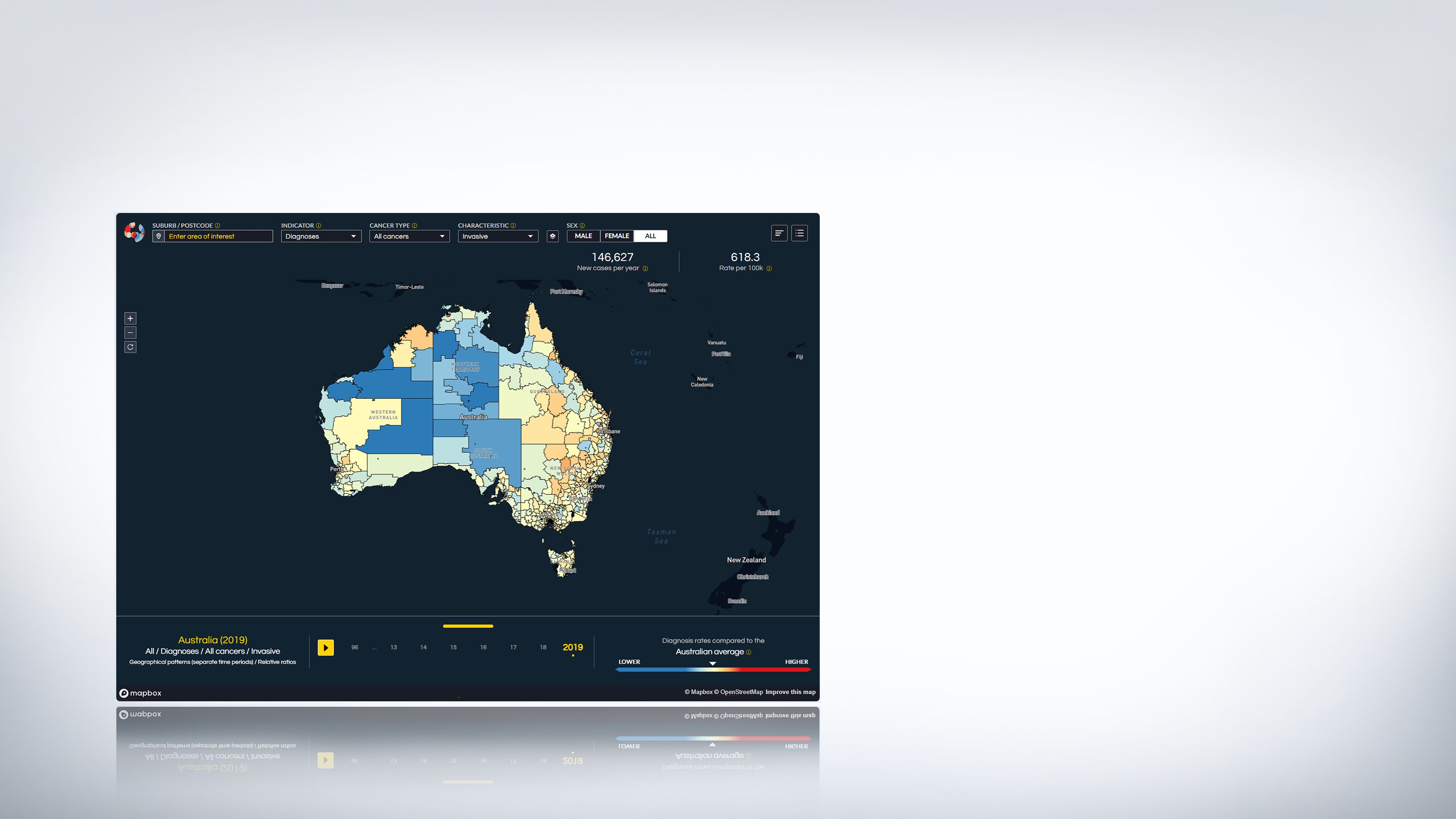
The Australian Cancer Atlas is a free, interactive tool that visually maps cancer rates across Australia. By using both spatial and temporal tracking of cancer, it allows users to see cancer patterns over time and across various regions, comparing diagnosis and survival rates and other measures over time.
The Atlas uses colour coding to represent the rates for cancer diagnosis, survival, risk factors, hospital treatments, and screening and testing, helping users to identify areas with higher or lower rates of these indicators compared to the Australian average. It also displays circles showing how the modelled numbers vary across the country.
This interactive visualisation tool helps people to understand the meaning of complex statistics associated with cancer diagnosis and survival. The statistics presented in the Australian Cancer Atlas are ‘modelled estimates’. Original data provided by multiple sources are modelled using advanced statistical methods. Only a small number of people tend to be diagnosed with cancer in each geographical area, and so statistical methods are used to ‘smooth’ the numbers to reduce the impact of random fluctuation and measure the level of uncertainty in the modelled estimates.
"The Australian Cancer Atlas provides an enhanced view of what the geographical disparities are, and highlights where the impact of cancer is greatest"


Distinguished Professor Kerrie Mengersen
School of Mathematical Sciences, Queensland University of Technology


Who is the Australian Cancer Atlas for?
The tools and features of the Atlas are freely accessible to all, providing a comprehensive platform tailored to both the general public and more specialist users.
For the general public, the Atlas includes features that allow them to explore cancer-related statistics in their area and compare those corresponding statistics with other areas across Australia.
For more specialist users, it offers advanced data visualisation capabilities that enable the identification of complex patterns, such as the relationship between area remoteness and cancer incidence. Through these data, we can inform decision-making and policy planning. This, of course, does not mean one group of users cannot use or benefit from the other features.
The Atlas provides a valuable resource for advancing cancer research, shaping effective public health policies, and raising public awareness about cancer prevention and care. It helps all users to connect the big picture of statistics about cancer with a localised view.
How are communities using the Australian Cancer Atlas?
Through the Atlas, it was identified that the survival rate after a diagnosis of bowel cancer among residents of Biloela was 20% worse than the national average.
In response to this information, the Queensland Rotary Bowel Scan Committee launched a week-long community engagement and awareness campaign called #GetYourBumIntoGearBiloela Week.


The initiative, which involved the entire community, including local authorities, healthcare professionals, businesses, sports groups, and volunteers, raised awareness of bowel cancer symptoms and encouraged participation in National Bowel Cancer Screening Program.


Brief history of the Atlas


2009. Work commences on the Atlas of Cancer in Queensland
The origins of the Australian Cancer Atlas can be traced back to the Atlas of Cancer in Queensland, a research report that was initiated in 2009 by Cancer Council Queensland.
2011. The Atlas of Cancer in Queensland is published
The Atlas of Cancer in Queensland was published in 2011, coinciding with the 50th Anniversary of Cancer Council Queensland. The Atlas of Cancer in Queensland revealed variations in cancer diagnosis and survival based on location. The Atlas provided the first evidence of the extent of location-based variation in cancer diagnosis and survival across different small areas in Queensland.
January 2017. Work begins on the Australian Cancer Atlas
The idea of a national cancer Atlas was initially proposed around 2014 by researchers from FrontierSI, Cancer Council Queensland and Queensland University of Technology. It took more than two years from these initial discussions to secure funding, support from other relevant organisations, ethics approvals, and permission from data custodians. The Australian Cancer Atlas project officially began in January 2017.
September 2018. The Australian Cancer Atlas is launched
The interactive, web-based version of the first Australian Cancer Atlas was launched in September 2018 with diagnosis and survival data from 2003 to 2014 for 20 cancer types. The Atlas was updated in February 2021 to include data up to 2016 and one additional cancer type – classic myeloproliferative neoplasms (MPN).
March 2021. Work begins on version 2.0 of the Australian Cancer Atlas
Following the launch of the first Atlas, the project team recognised the potential to include additional features. However, it took time to organise the formal collaborations and funding required to start this expansion project. In March 2021, development began on the Australian Cancer Atlas version 2.0 with team members from Cancer Council Queensland, and QUT’s Centre for Data Science and VISER.
May 2024. Version 2.0 is released
The second version of the Australian Cancer Atlas was released in May 2024. This version expanded the original by including nine additional cancer types, a broader range of indicators, and tracking changes in geographical patterns over time. The data included covered years 1996 to 2019. This project was a collaboration between Cancer Council Queensland and Queensland University of Technology, with funding from Cancer Council Queensland, the Viertel Charitable Foundation, an Australian Research Council Linkage Project Grant, and QUT.
Interesting facts about the Atlas

The Atlas has been awarded the Geospatial Council of Australia awards for Technical Excellence and Highest Achievement.

The Atlas uses data from all Australian population-based cancer registries, hospitals, Medicare, Census and national surveys.

There are 30 types of invasive cancer in the Atlas.

More than 40 people made direct contributions to the development of the Atlas.
How do I navigate around
the Atlas?
“The Australian Cancer Atlas allows you to slowly unpack the complex data it has to offer. Starting with a national overview, it was designed for the user to be in control of how much exposure they want through self-exploration. The experience invites the user to dive-in and discover what they need or want out of the Atlas.”

Sarah Azad
Senior UX/UI Designer, VISER (Visualisation and Interactive Solutions for Engagement and Research), Queensland University of Technology
The Atlas is designed with a user-centric, straightforward and intuitive interface, consisting of three main sections:


Interacting with the top menu bar controls what appears on the map and the drawer, while actions on the map or drawer influence each other. The drawer offers a summary of the information displayed on the rest of the screen.
While the Atlas can be used in diverse ways depending on user objectives, a basic navigation pattern to explore the diagnosis or survival rates of a particular cancer type in your suburb or town is outlined below. Scroll down to see how it works.
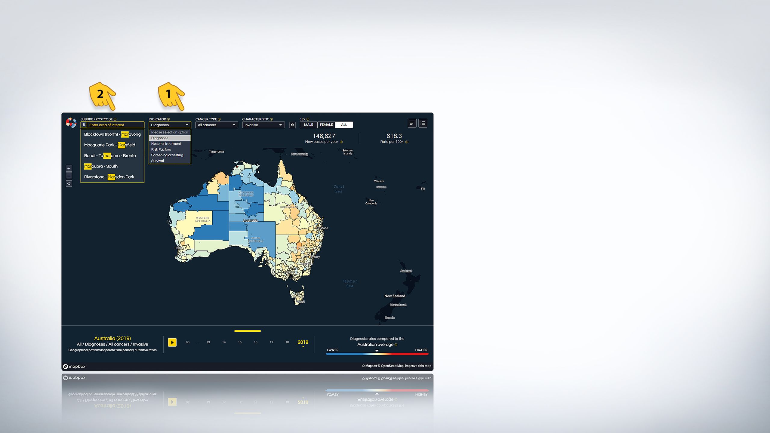
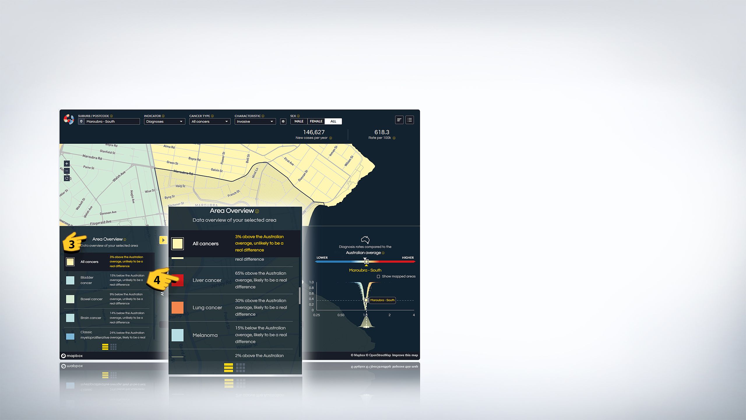
First select a SUBURB or POSTCODE of your choice.
Then select INDICATOR such as diagnosis or survival.
Select a CANCER TYPE and the map will display the impact of that cancer type in the selected suburb.
Click on the drawer section at the bottom of the Atlas to reveal the ‘AREA OVERVIEW’ which will display other cancer types in the suburb.


The Atlas is designed with a user-centric, straightforward and intuitive interface, consisting of three main sections. These sections are...
1. the top menu bar
2. the map
3. the bottom drawer
Interacting with the top menu bar controls what appears on the map and the drawer, while actions on the map or drawer influence each other. The drawer offers a summary of the information displayed on the rest of the screen.
While the Atlas can be used in diverse ways depending on user objectives, a basic navigation pattern to explore the diagnosis or survival rates of a particular cancer type in your suburb or town is outlined below. Scroll down to see how it works.
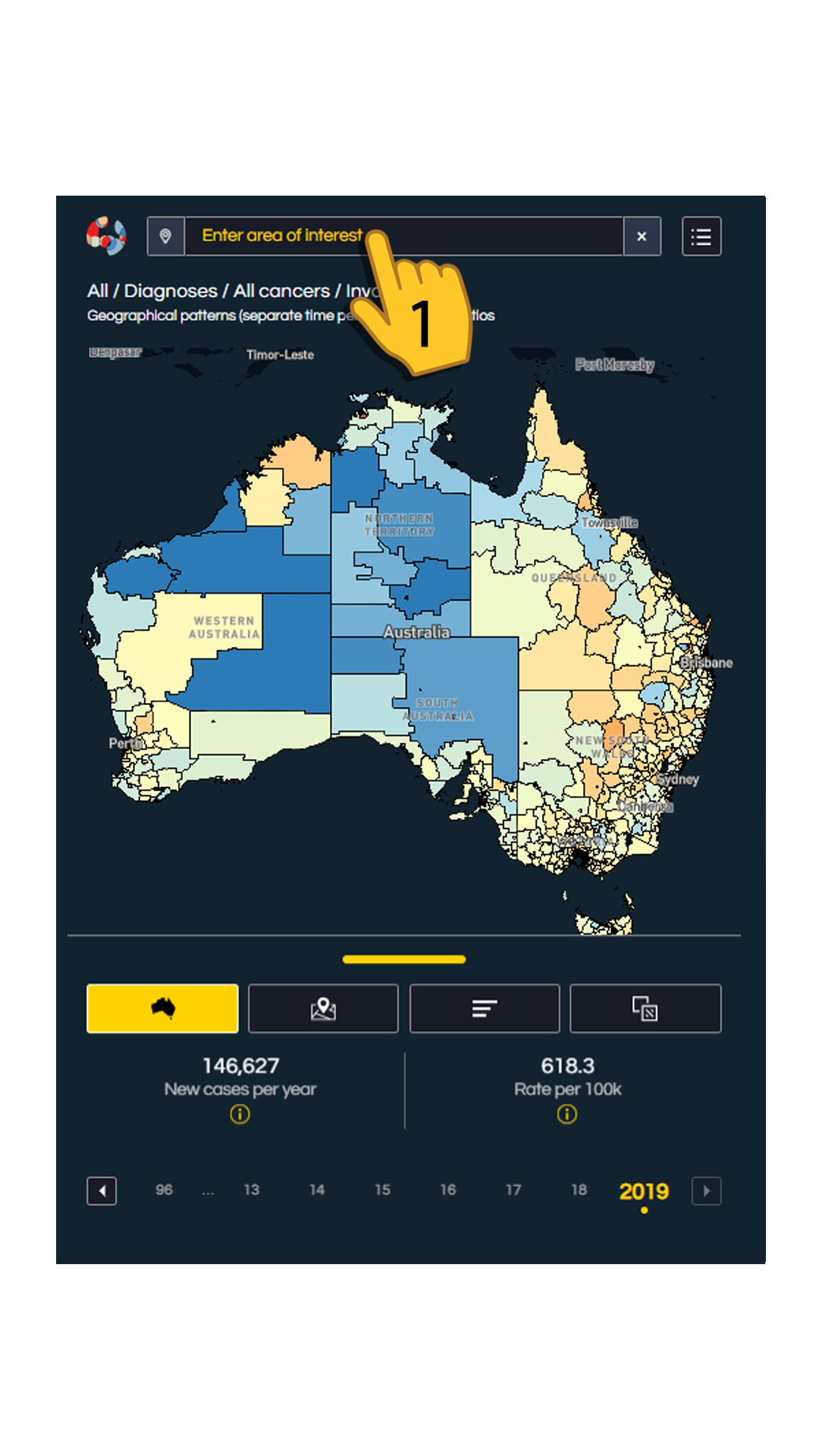
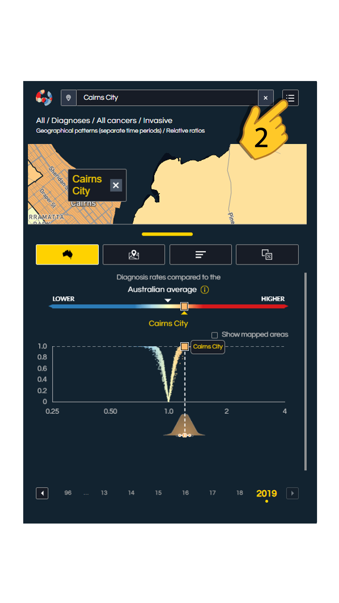
1. First select an area of interest. You can type the name of a SUBURB or it's POSTCODE.
2. Tap on the square-shaped 'Filter Options' button in the top right corner to open a list of filters.
3. From the list, select an INDICATOR of your choice such as diagnosis or survival.
4. Select a CANCER TYPE and the map will display the impact of that cancer type in the selected suburb.
Additional filters are available in the top-right corner of the Atlas to refine your results further for visualising the impact of cancer. These filters include:


This filter lets you segment the map based on the socio-economic status of the areas, making the relationship between area disadvantage and cancer easy to investigate.

If you want to focus on a certain state(s) instead of all areas of the country, this filter lets you switch on and off the display of each state of Australia.

A useful filter that makes it easier to study any possible link between cancer and remoteness of areas.

This filter lets you display the locations of hospitals and geographical boundaries on the map.
It is important to note that through the Atlas you can see how different types of cancer affect a specific region. However, these results do not necessarily indicate an individual's personal cancer risk. To understand your personal risk, use the cancer risk calculator provided below:

Colour coding in the Atlas
The Australian Cancer Atlas uses three colour families, reds, blues and yellows, to indicate diagnosis and survival rates on the map compared to the Australian average.
For diagnosis rates:
• Yellow coloured areas represent areas with diagnosis rates similar to the Australian average.
• Red areas represent higher diagnosis rates compared to the Australian average.
• Blue areas denote lower diagnosis rates compared to the Australian average.
For survival rates:
• Yellow coloured areas represent areas with survival rates similar to the Australian average.
• Red areas represent worse survival rates compared to the Australian average.
• Blue areas represent better survival rates compared to the Australian average.


Where did the data come from and how were the statistics calculated?

De-identified data about individual cancer cases in Australia were sourced from the eight state and territory population-based cancer registries across Australia, through the Australian Cancer Database.
Additional data were obtained through other sources, such as those relating to risk factors (National Health Survey) cancer screening and testing (Medicare Benefits Schedule, BreastScreen Australia, National Cervical Screening Registry, National Bowel Screening Registry), estimated residential population (Australian Bureau of Statistics), hospital related treatment (National Hospital Morbidity Database) and population mortality (Registry of Births, Deaths and Marriages).
The statistical models were based on the Bayesian framework. Bayesian spatial modelling uses information about neighbouring geographical areas to improve the stability of the estimates about a particular area. This approach helps to protect the confidentiality of the people that the data represents.
Spatiotemporal modelling goes a step further by showing how cancer rates change over both space (different regions) and time. This type of model helps us track whether cancer rates in specific areas have increased or decreased over the years. Spatiotemporal models can therefore show us whether the differences across Australia have changed over time.
The Bayesian models also provide details about the uncertainty in these estimates, so we can understand how likely the estimate for a specific area is truly above or below the Australian average. This uncertainty is visualised in multiple ways throughout the Atlas such as the V-plot and wave-plot. As soon as an area on the map is clicked, a drawer menu pops up from the bottom of the window containing V-plot and wave plot.
V-Plot shows how the cancer rates in that area compare to the Australian average as well as how likely it is that this difference is real. A dot near the top of the plot indicates the likelihood of the rate being different from the national average. If it is near the bottom of the plot, it means that it is unlikely that the difference is real.
The level of confidence about an estimate is displayed through the wave-plot located under the v-plot. A narrow and tall wave means that estimate is quite accurate, while a wider and shorter wave suggests more uncertainty.


“To my knowledge, the Cancer Atlas is unparalleled globally and represents a landmark for how medical statistics can be made accessible to a wide variety of end-users.”

Professor David Whiteman
MBBS (Hons) PhD FAFPHM FAHMS
Senior Scientist and Group Leader, Cancer Control Group
QIMR Berghofer Medical Research Institute
How can we use the Atlas to reveal the impact of cancer in Australia?
The Atlas can be used to answer common questions related to the location of cancer types, change over time, and the difference between relative rates and absolute counts.


How can I find out which cancer type has the highest rates of diagnosis compared to the Australian average in my area?
To see the cancers in your area:
1. select 'diagnosis' from the 'INDICATOR' drop down menu.
2. type the name of your suburb.
3. The drawer will pop out from the bottom of the page where on the left the 'Area Overview' will be displayed.
4. You can scroll Area Overview up and down to view the diagnosis rate colours of each of the separate cancer types in your suburb compared to the Australian average.
How can I see the changes in cancer diagnosis over time?
To display the change in rate of a cancer over time, the Atlas has a temporal or 'trend' graph located in the bottom drawer.
1. First you will have to click the 'show advanced selections' button.
2. From the menu that appears, change the 'type of menu' to 'changes over time
3. The trend graph will appear from the bottom drawer which you can 'play' to see how the diagnosis rate (from 1996 to 2019) or survival rate (from 2002/03 to 2018/19) has changed over time. You can also click on a particular year (represented by the dots inside the graph) to visualise diagnosis or survival rates of a cancer type in that year and compare it with another year.


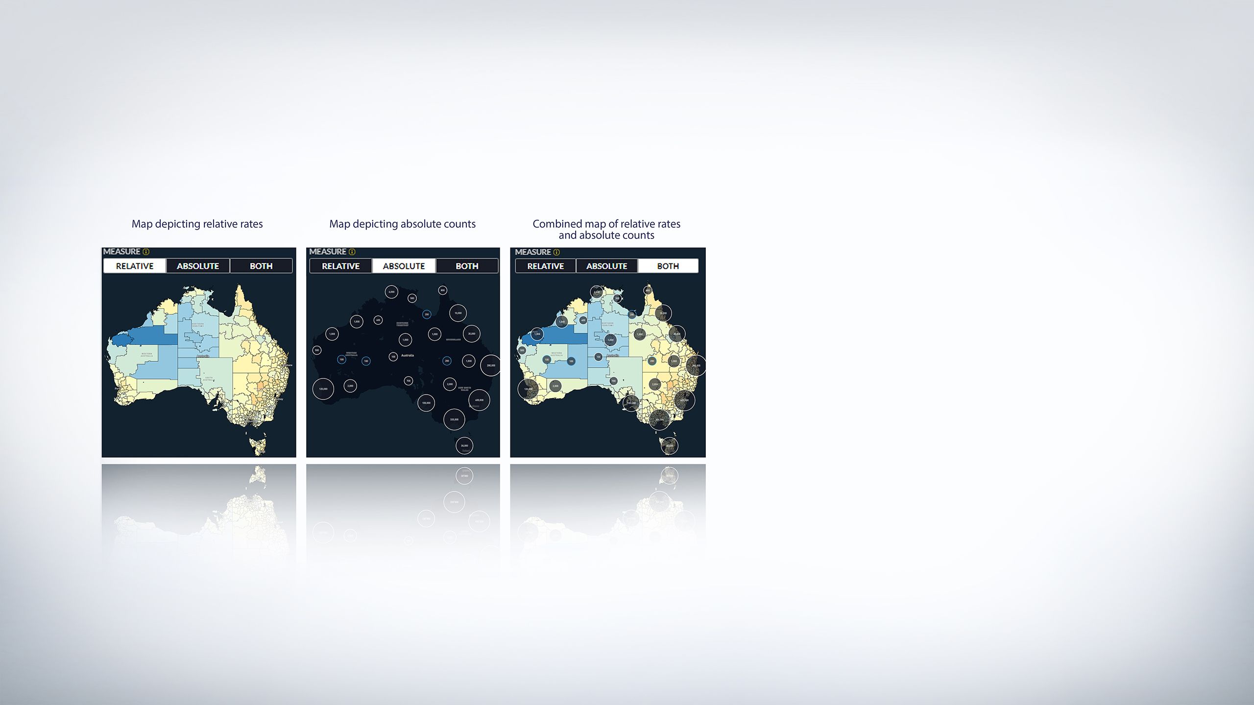
What is the difference between relative rates and absolute counts?
Relative rates compare the rate of cancer in one geographical area to the national average, showing whether it is higher or lower. Absolute counts show the approximate, or modelled, number of cancer cases in a specific area. While relative rates help understand risk, absolute counts reflect the actual burden of disease and informs the optimal placement of health services based on the numbers of people.
It is important to note that instead of the actual number of cancer patients, the absolute counts are presented as modelled counts (i.e. estimates generated using statistical models) in the Atlas. The modelled counts improve the reliability of the estimates and prevent any issues with confidentiality of the counts for small areas. The Atlas provides three different map views to display the measures: relative view, absolute view, and combined view.
Looking at lung cancer on the next slide can help to understand the difference between relative rates and absolute counts:
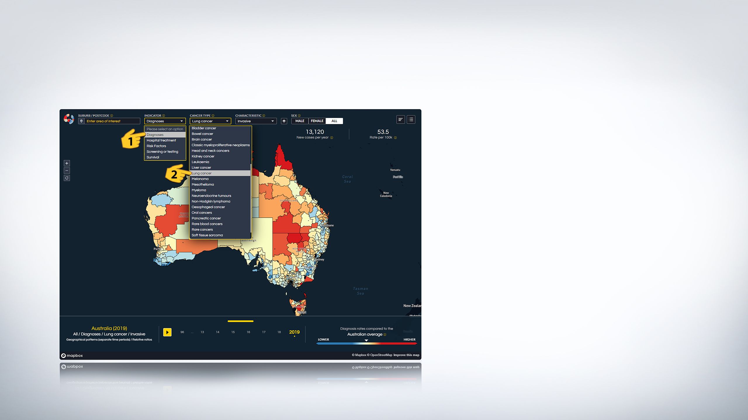
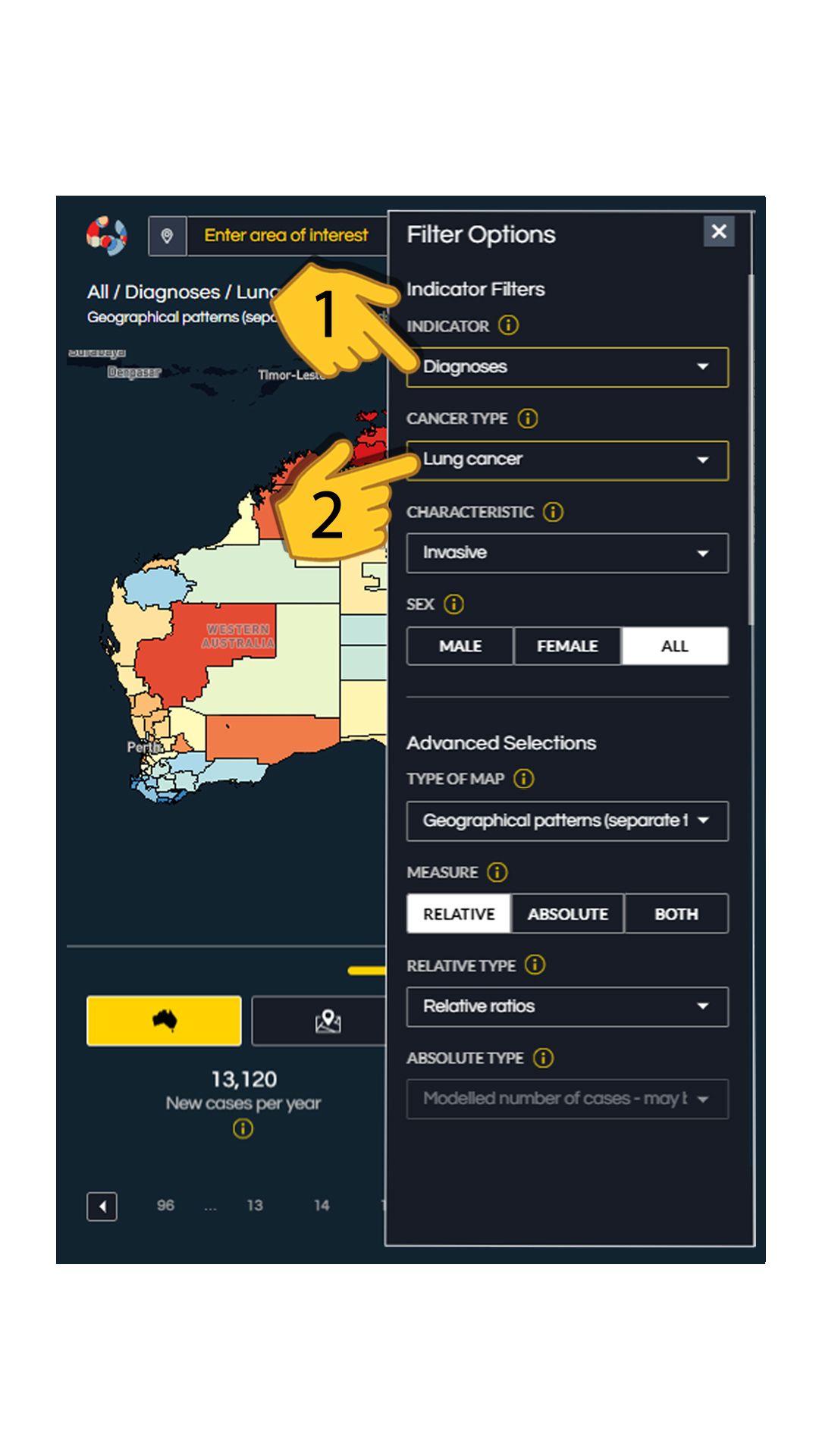
1. In the Atlas, set the ‘INDICATOR’ as ‘Diagnoses’.
2. Select lung cancer as the CANCER TYPE.
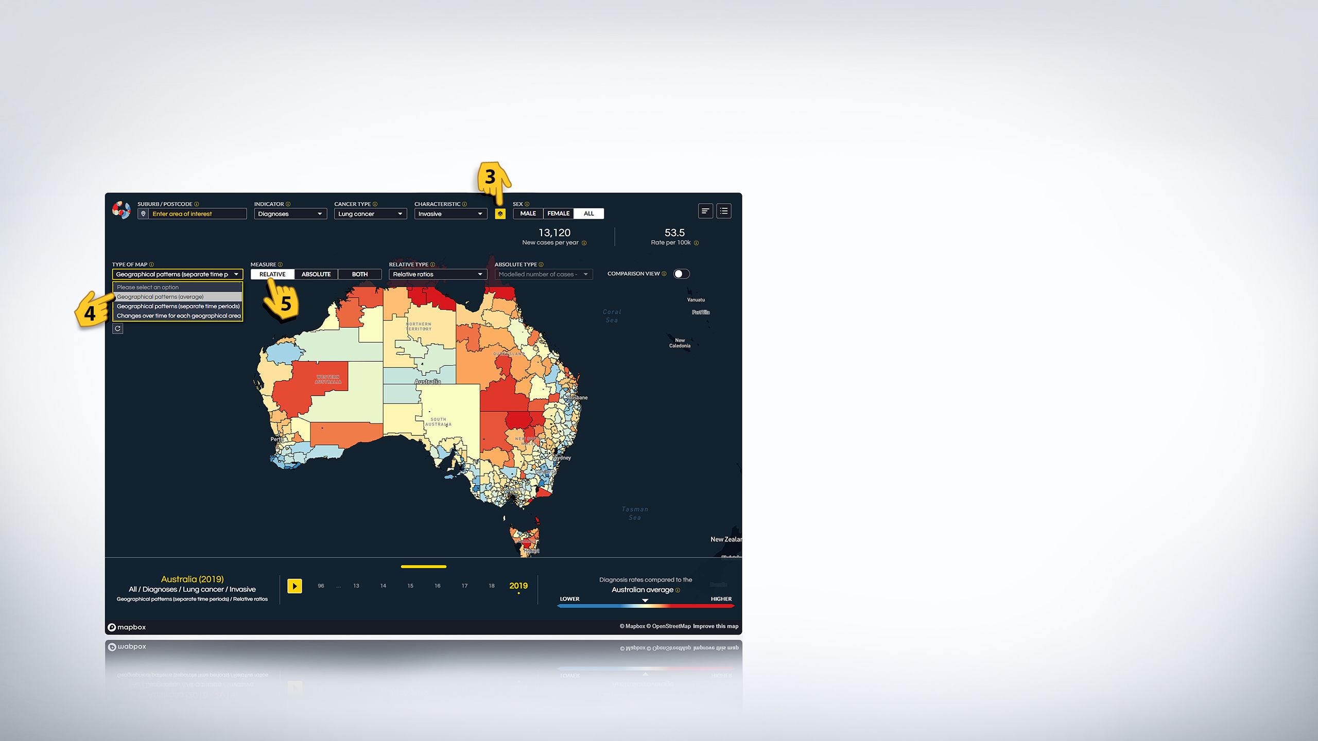
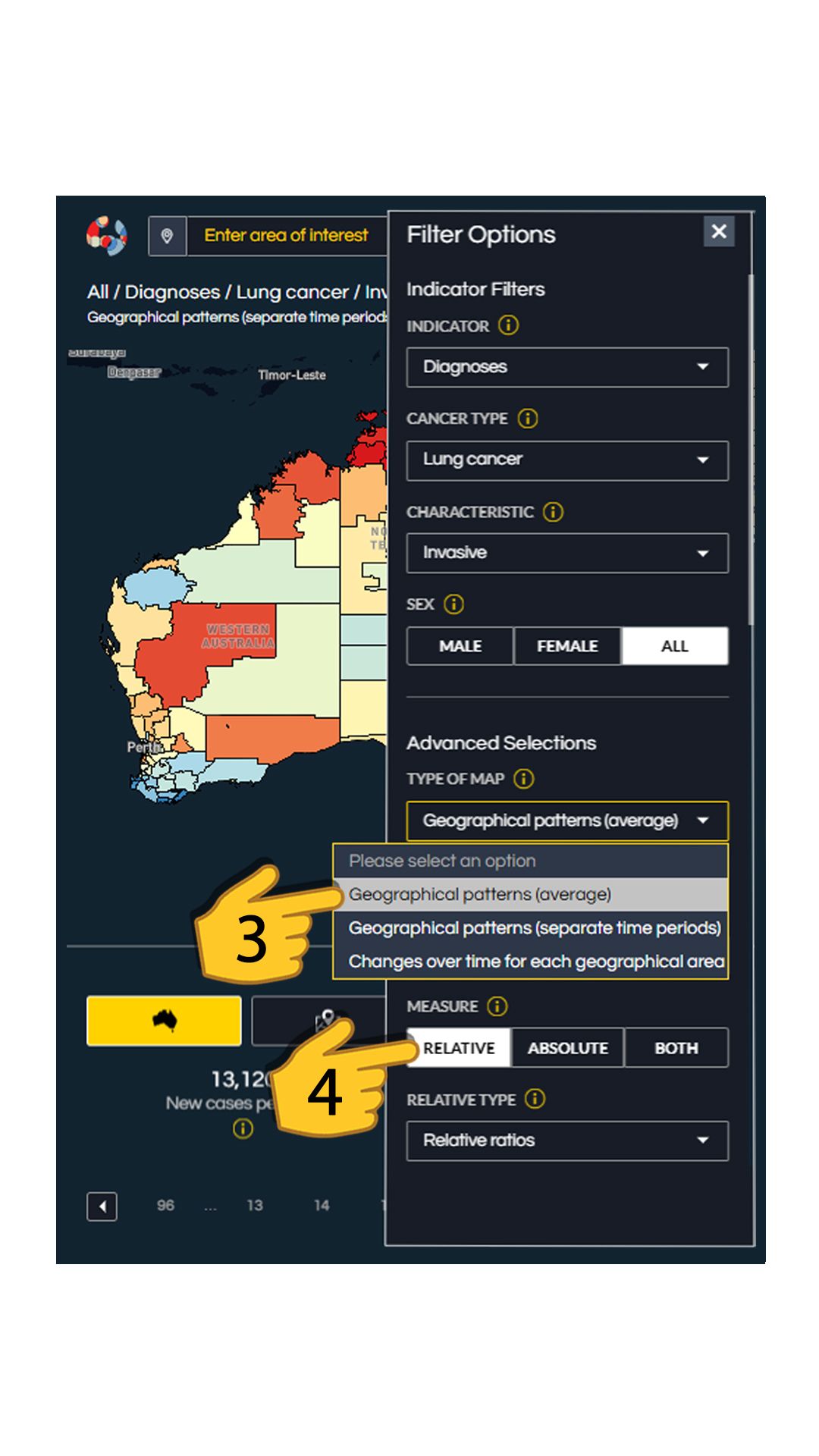
3. Click on the small ‘advanced selection’ button which will open a menu.
4. From that menu click on the ‘MAP TYPE’ and select ‘Geographical patterns (average)’.
5. Ensure that the ‘MEASURE’ is set to ‘Relative’.
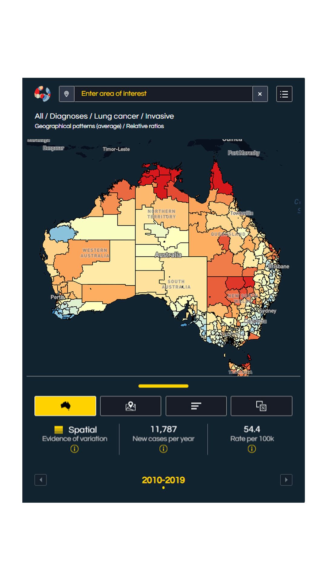
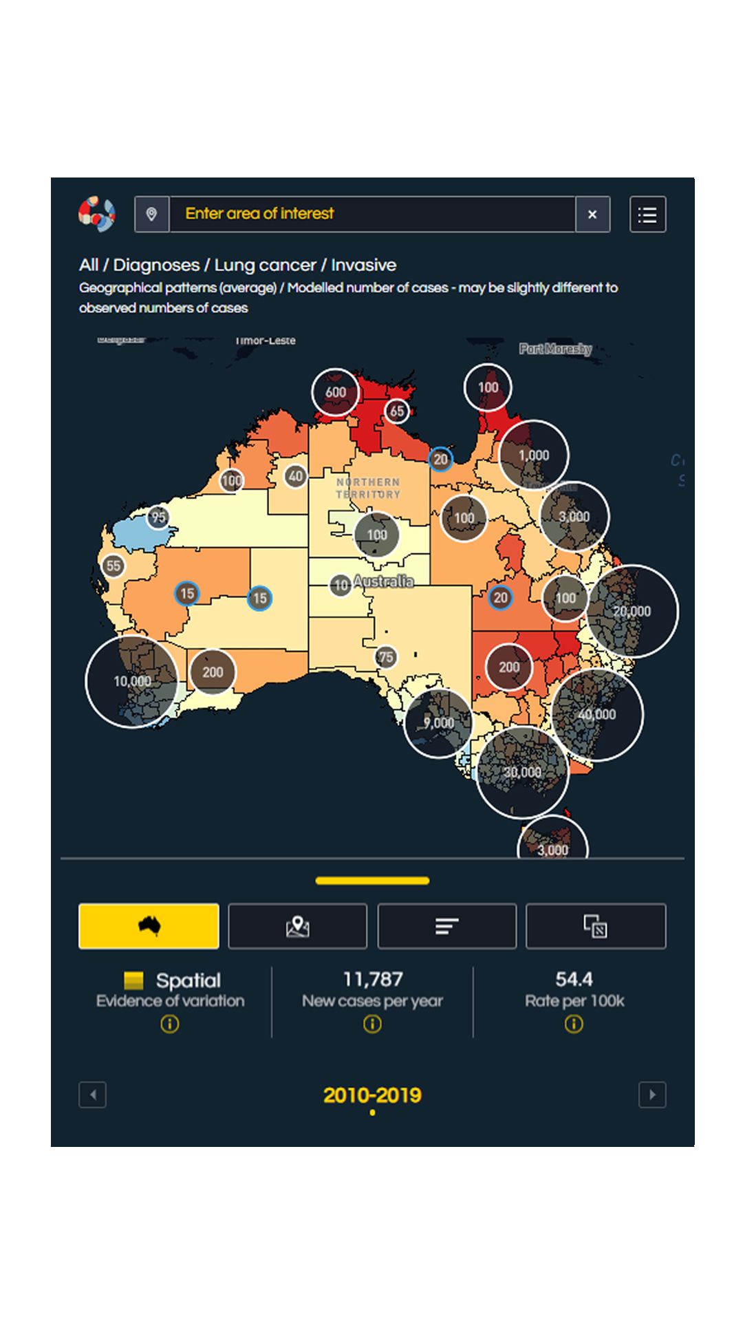
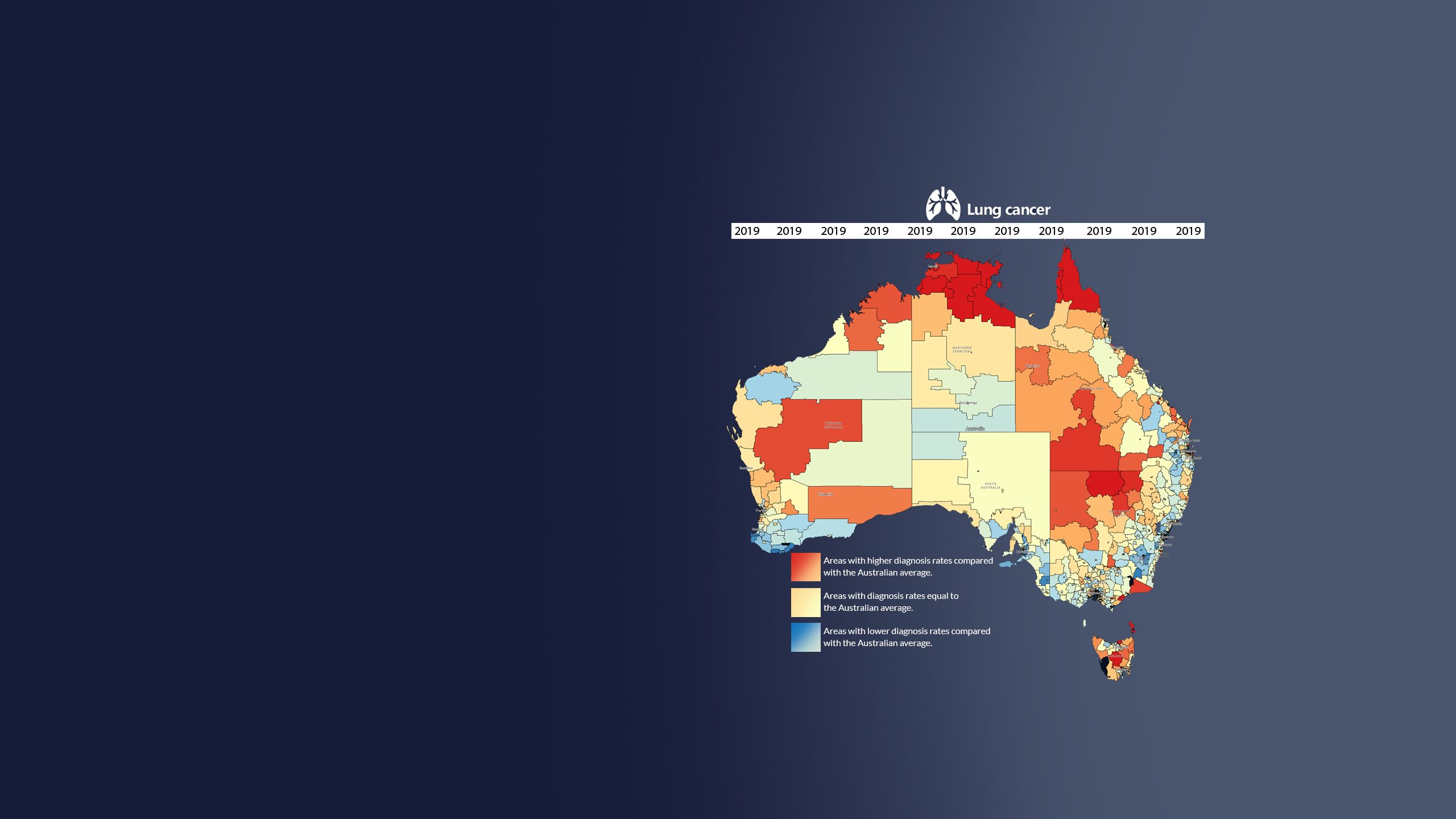
The map resulting from these settings shows the geographical patterns in lung cancer diagnosis rates relative to the Australian average over a ten-year period of time. You will notice that many regions in Australia are coloured red indicating higher than average diagnosis rates in those regions.
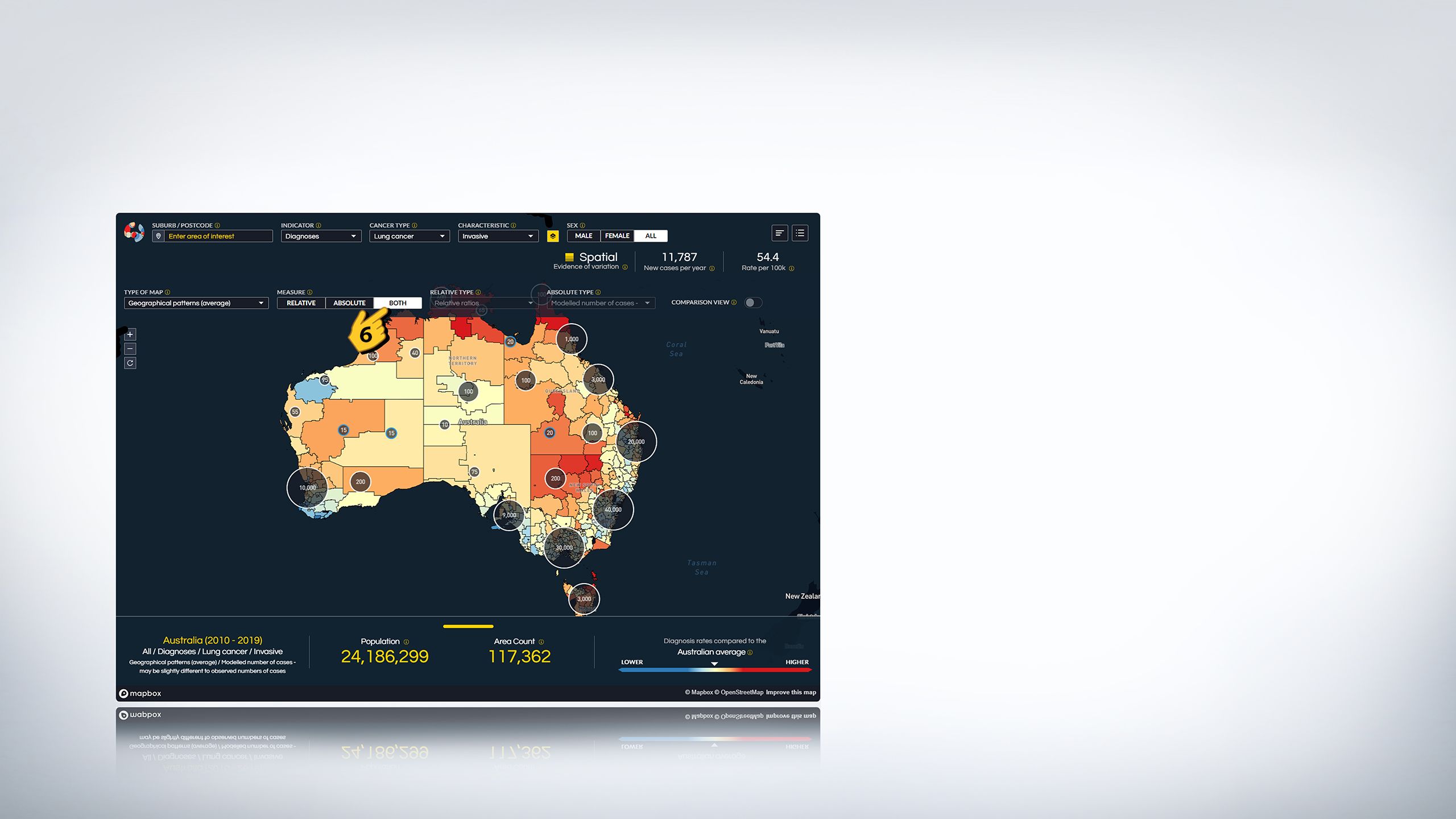
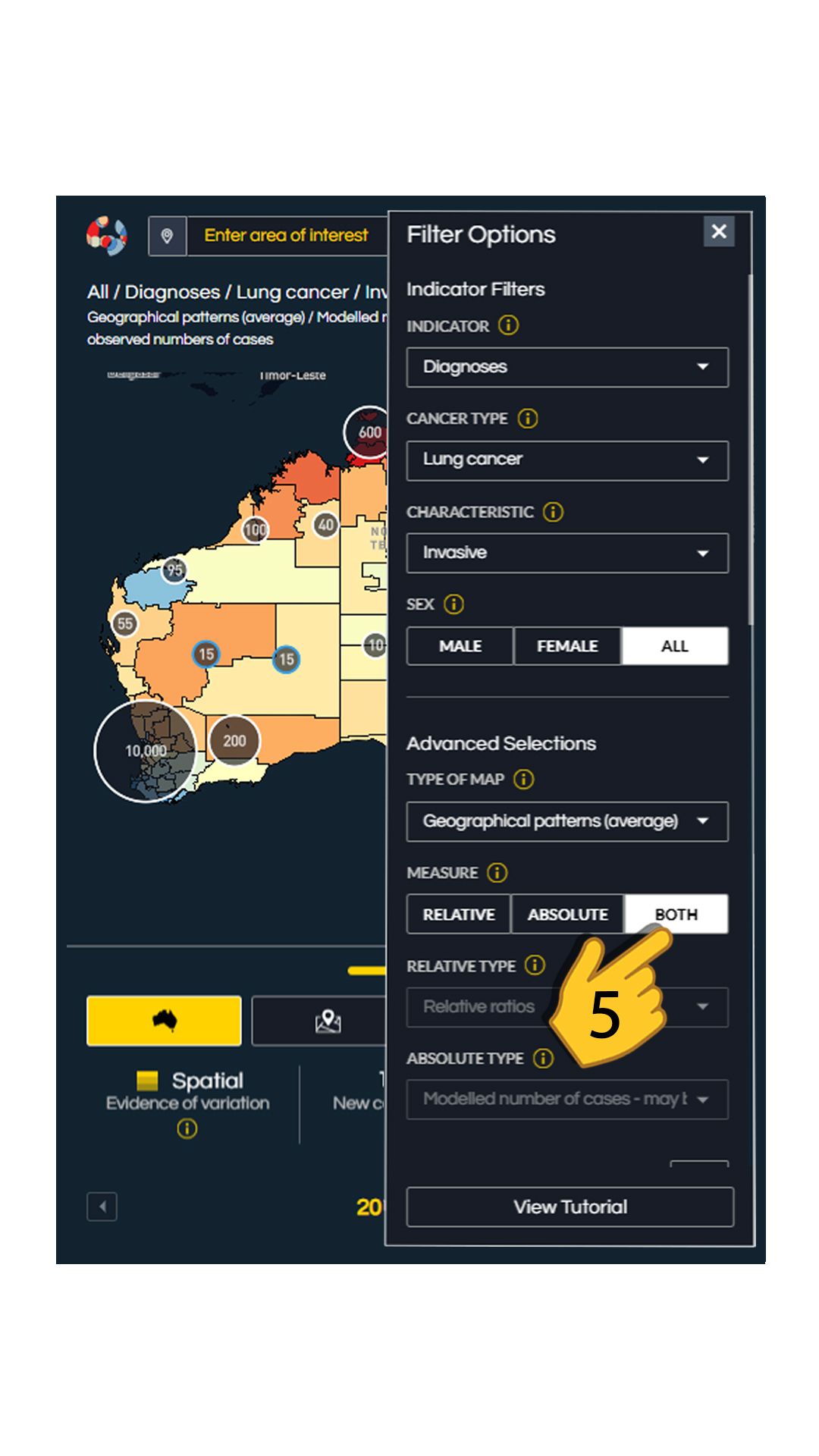
6. Now set the ‘MEASURE’ to ‘Both’. Small circles will appear on the map. These are absolute counts. You will notice now that that many areas with a higher-than-average diagnosis rate of lung cancer, shown in red, have smaller circles and smaller counts compared to blue areas.
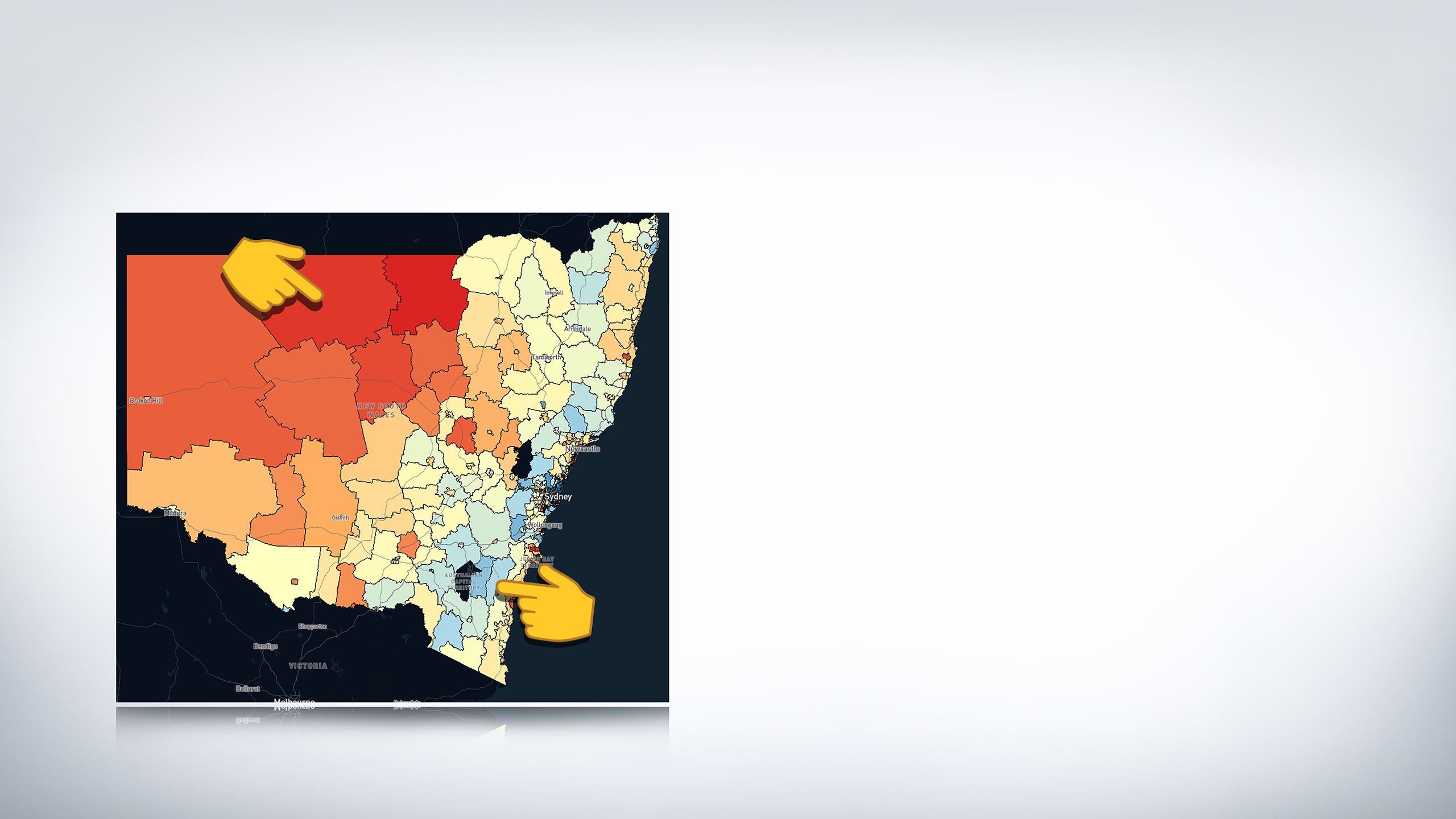
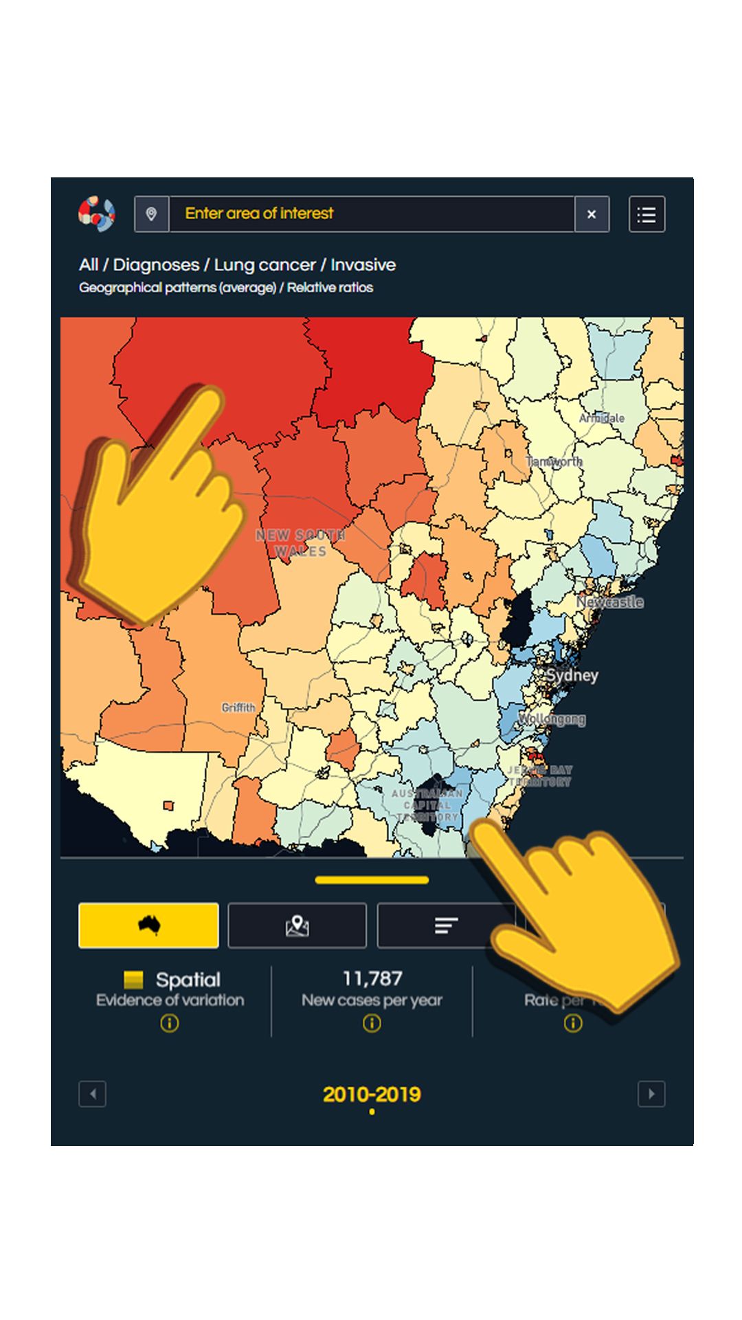
Let's zoom in on New South Wales to see the comparison.
As you can see the top area is in red indicating higher than average diagnosis rates, while the lower areas are mostly blue.
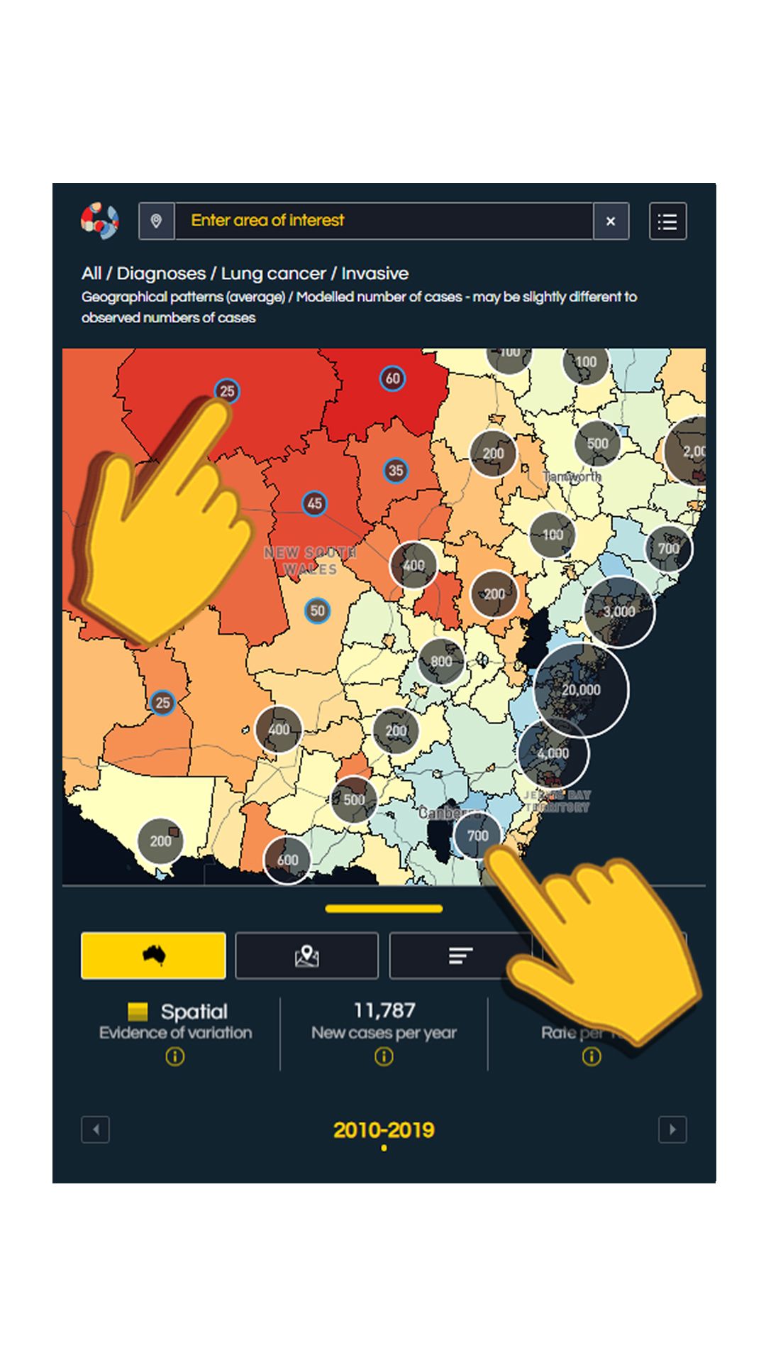
Now focus on the two areas near the fingertips and scroll down.
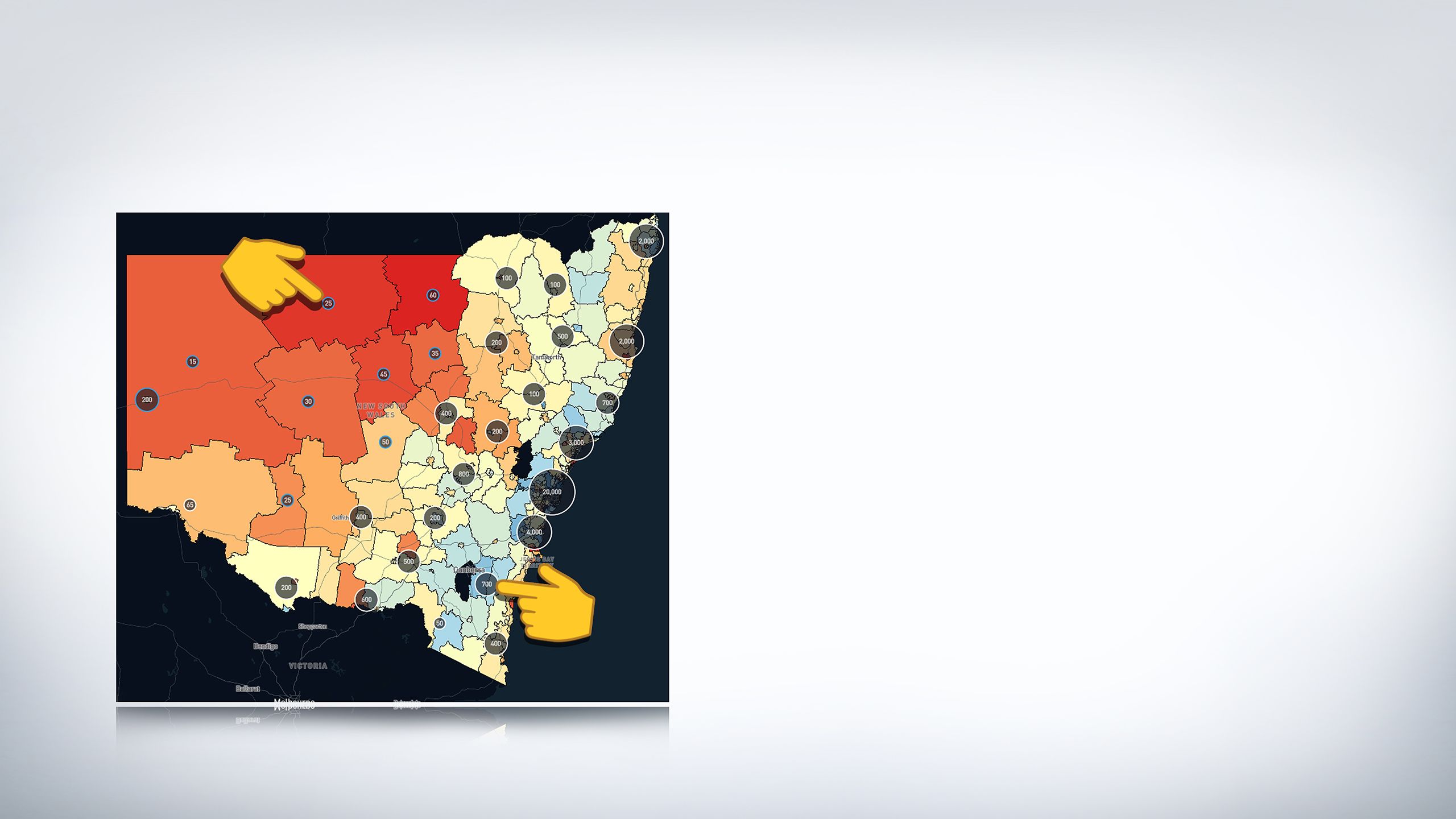
You can see that although the top area is red, the modelled counts are only 25 compared to the blue area where the modelled counts are significantly higher (counts =700).


This means that even though this area has a high relative risk of lung cancer, fewer people living in that area are actually diagnosed with it. This is highly influenced by population numbers, so highlights the need to consider both the relative risk of diagnosis in an area and the actual demand for medical services.

How can I find out which cancer type has the highest rates of diagnosis compared to the Australian average in my area?


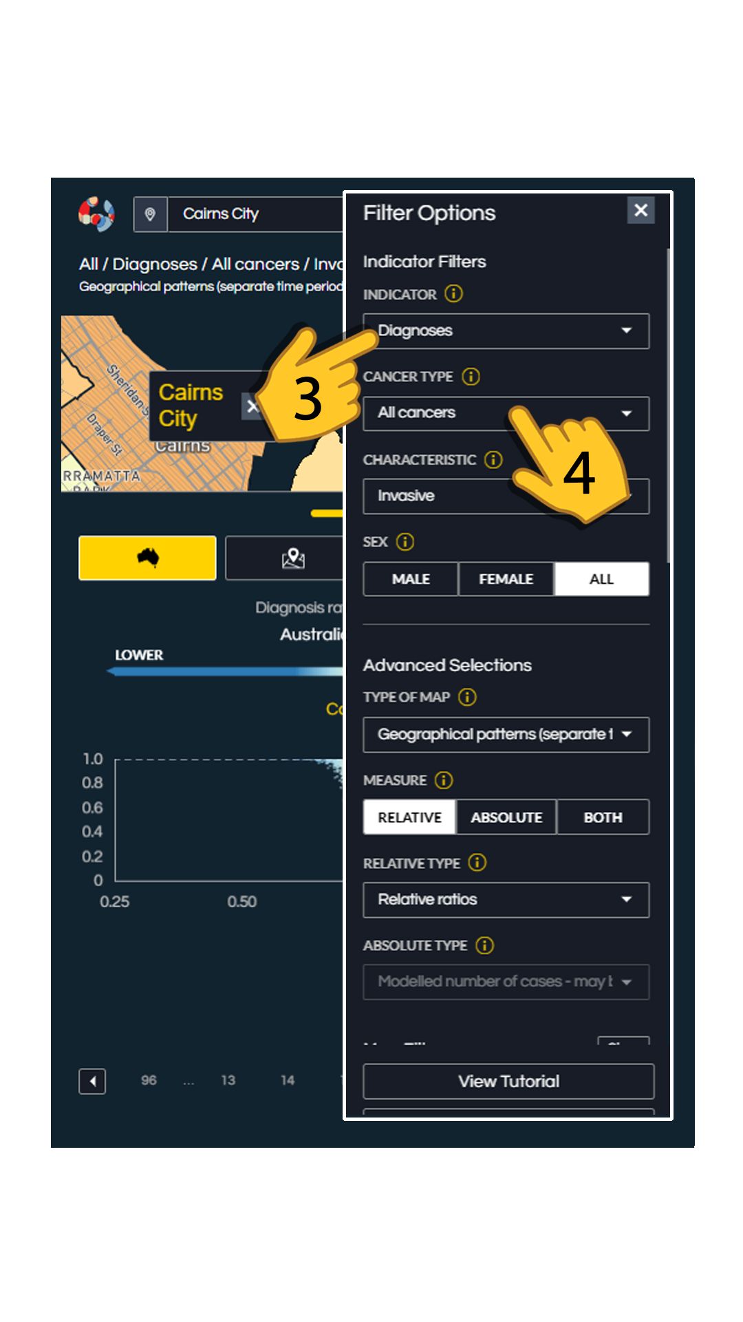

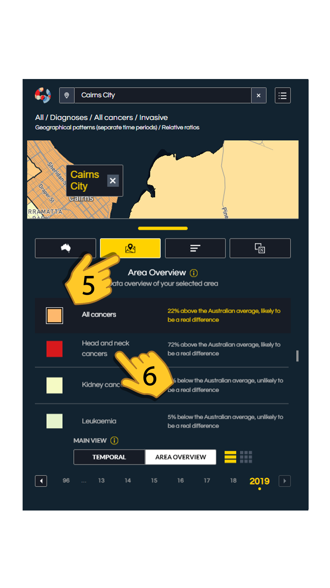
To see the cancers in your area:
1. type the name of your suburb.
2. tap on the 'Filter Options' button located in the top right corner. This will open a list of filters or menus.
3. make sure 'diagnosis' is selected in the 'INDICATOR' drop down menu.
4. make sure that 'All Cancers' is selected in the 'CANCER TYPE' drop down menu.
5. tap on the location icon (shown in yellow). This will open 'Area Overview'.
6. You can scroll Area Overview up and down to view the diagnosis rates of each of the separate cancer types in your suburb compared to the Australian average. The red colours depict cancers with highest diagnosis rates in your suburb compared to the Australian average.
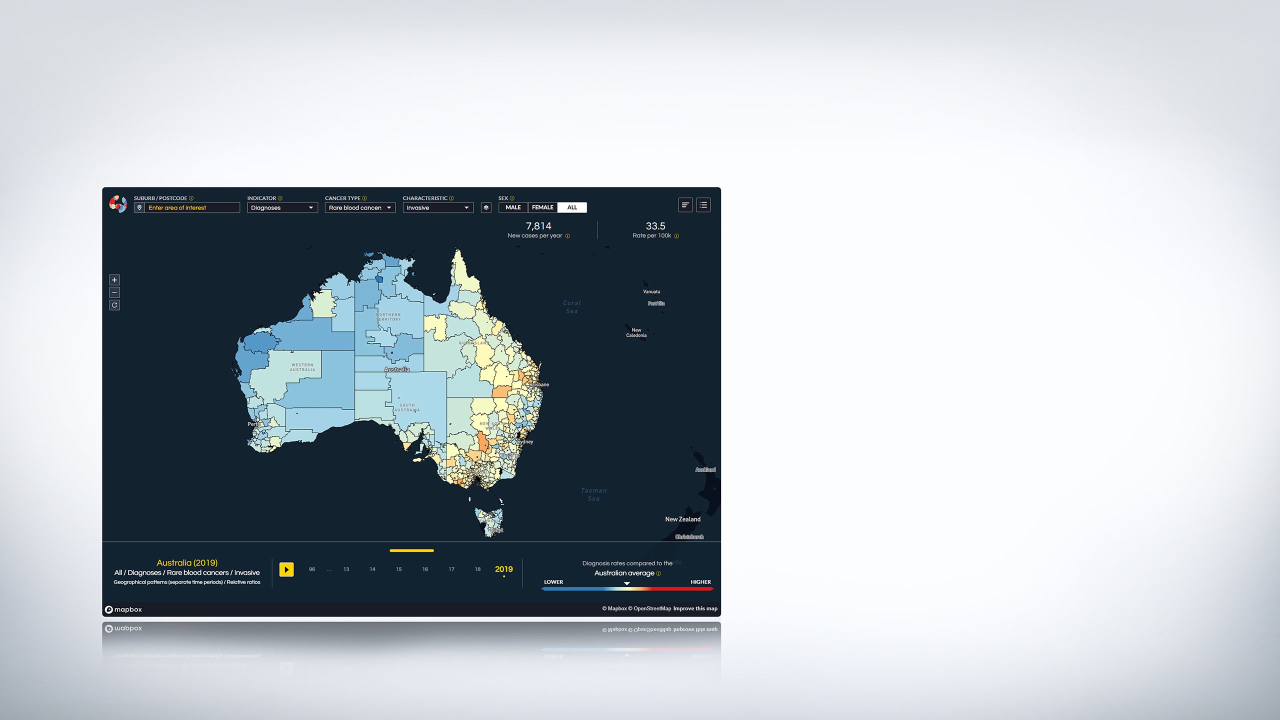
How can I see the changes in cancer diagnosis over time?

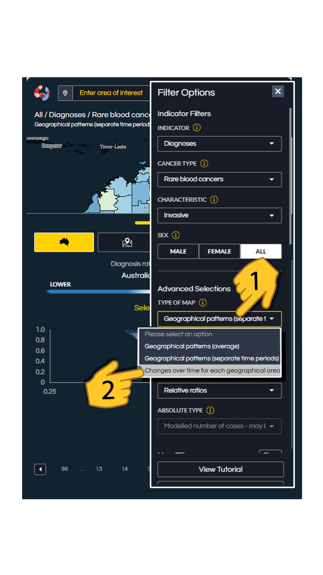

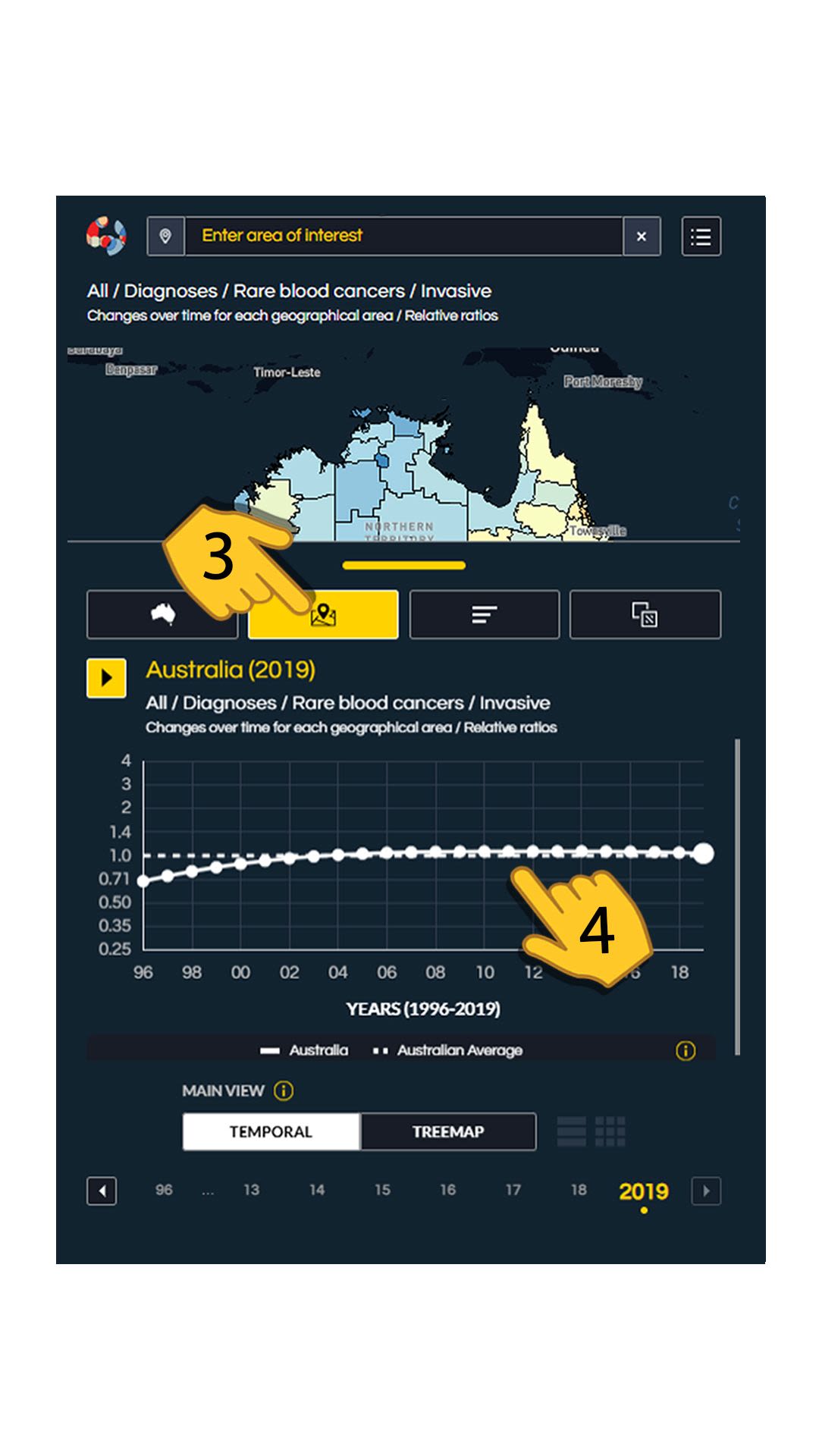
To display the change in rate of a cancer over time, the Atlas has a temporal or 'trend' graph located in the bottom drawer.
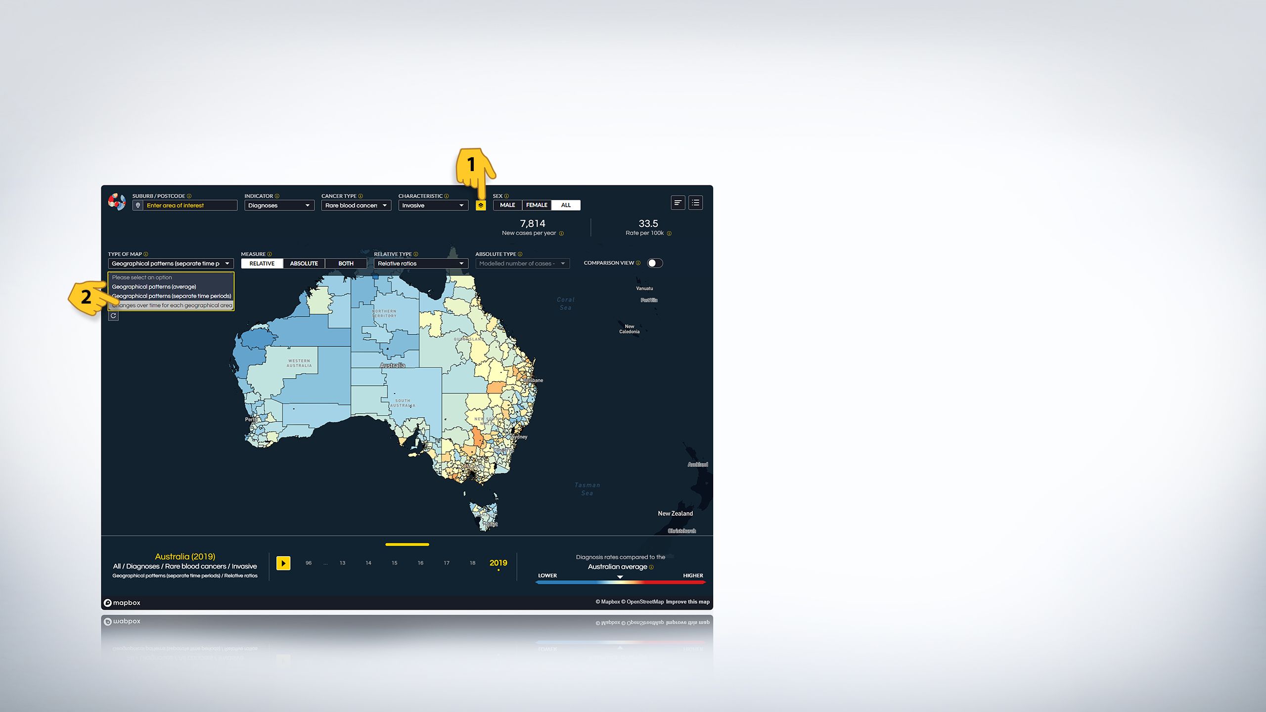
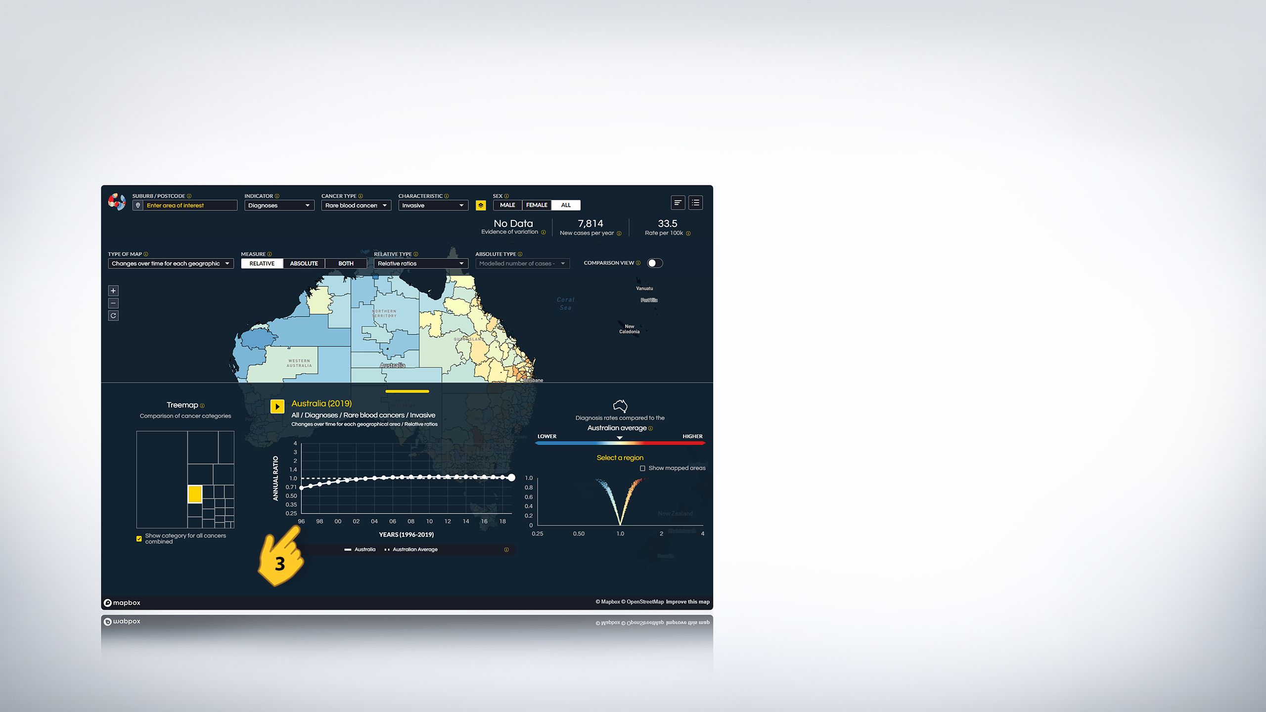
1. First you will have to change the type of the map. Tap on the TYPE OF MAP which will display a drop down menu.
2. From the menu select'Changes over time for each geographical area'.
3. On the 'drawer' tap on the 'Location' icon.
4. A dotted trend graph will appear which you can 'play' (by tapping the play button) to see how the diagnosis rate (from 1996 to 2019) or survival rate (from 2002/03 to 2018/19) has changed over time. You can also click on a particular year (represented by the dots inside the graph) to visualise diagnosis or survival rates of a cancer type in that year and compare it with another year.
What is the difference between relative rates and absolute counts?
Relative rates compare the rate of cancer in one geographical area to the national average, showing whether it is higher or lower. Absolute counts show the approximate, or modelled, number of cancer cases in a specific area. While relative rates help understand risk, absolute counts reflect the actual burden of disease and informs the optimal placement of health services based on the numbers of people.
It is important to note that instead of the actual number of cancer patients, the absolute counts are presented as modelled counts (i.e. estimates generated using statistical models) in the Atlas. The modelled counts improve the reliability of the estimates and prevent any issues with confidentiality of the counts for small areas.
The Atlas provides three different map views to display the measures: relative view, absolute view, and combined view.


Looking at the lung cancer example below can help us understand the difference between relative rates and absolute counts.


1. In the Atlas, set the ‘INDICATOR’ as ‘Diagnoses’.
2. Select lung cancer as the CANCER TYPE.
3. From THE 'TYPE OF MAP' select ‘Geographical patterns (average)’.
4. Ensure that the ‘MEASURE’ is set to ‘Relative’.
The map resulting from these settings shows the geographical patterns in lung cancer diagnosis rates relative to the Australian average over a ten-year period of time. You will notice that many regions in Australia are coloured red indicating higher than average diagnosis rates in those regions.
5. Now set the ‘MEASURE’ to ‘Both’.
Small circles will appear on the map. These are absolute counts. You will notice now that that many areas with a higher-than-average diagnosis rate of lung cancer, shown in red, have smaller circles and smaller counts compared to blue areas.
Let's zoom in on New South Wales to see the comparison.
As you can see the top area is in red indicating higher than average diagnosis rates, while the lower areas are mostly blue.
Now focus on the two areas near the fingertips on the map and scroll down.
You can see that although the top area is red, the modelled counts are only 25 compared to the blue area where the modelled counts are significantly higher (counts =700).

This means that even though this area has a high relative risk of lung cancer, fewer people living in that area are actually diagnosed with it. This is highly influenced by population numbers, so highlights the need to consider both the relative risk of diagnosis in an area and the actual demand for medical services.
"With the recent availability of the Australian Cancer Atlas, we can now map the incidence of liver cancer...This type of detailed mapping is key to the identification of priority areas to inform public health action in reducing this burden."

Jennifer MacLachlan
Epidemiologist, WHO Collaborating Centre for Viral Hepatitis, Melbourne


What are some examples of insights that can be gained from the Atlas?


1. Geographical inequalities persist
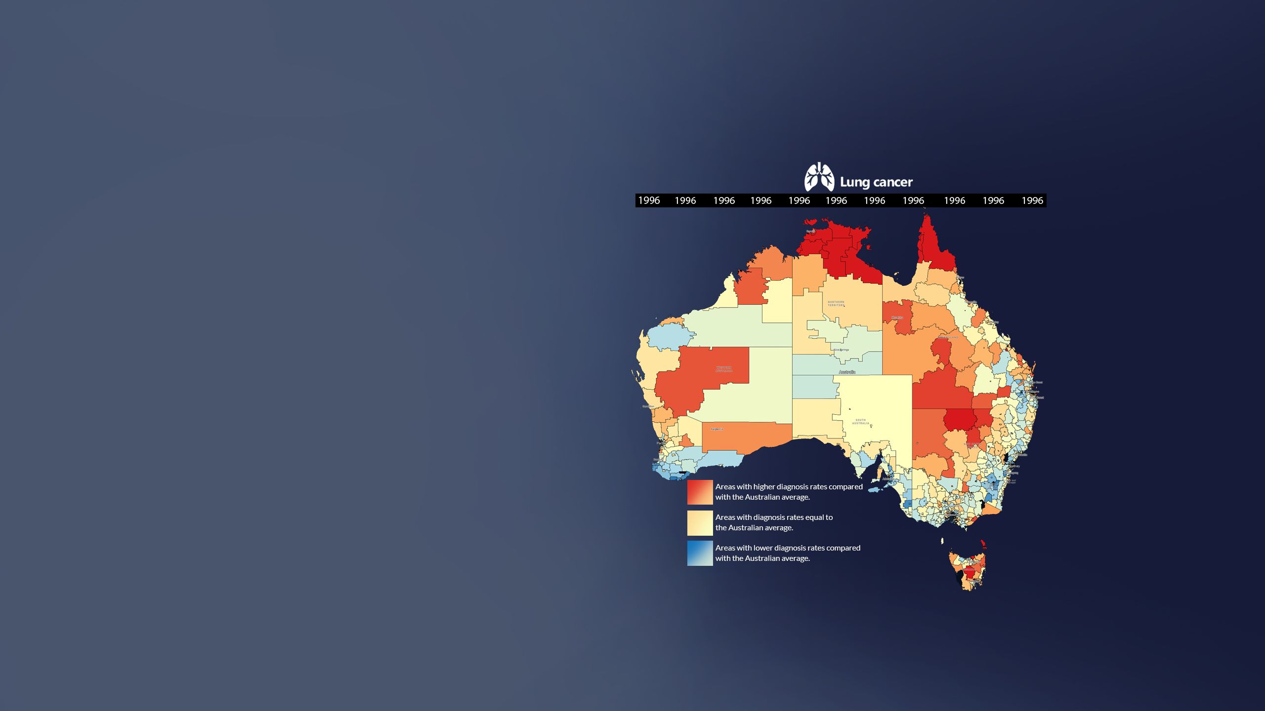
The Atlas shows that geographical inequalities have largely remained unchanged for the last 20 years.
For example, the thematic map for lung cancer diagnosis in Australia in 1996 is very similar to the corresponding map (next page) for lung cancer diagnosis in 2019.
Scroll down to compare this map with the corresponding map from 2019.
You might have noticed that the map does not change much. This shows that the issue of geographical inequalities has continued over the last 2 decades despite the fact that achieving equity in health for Australians was identified in 2007 as a major health priority.
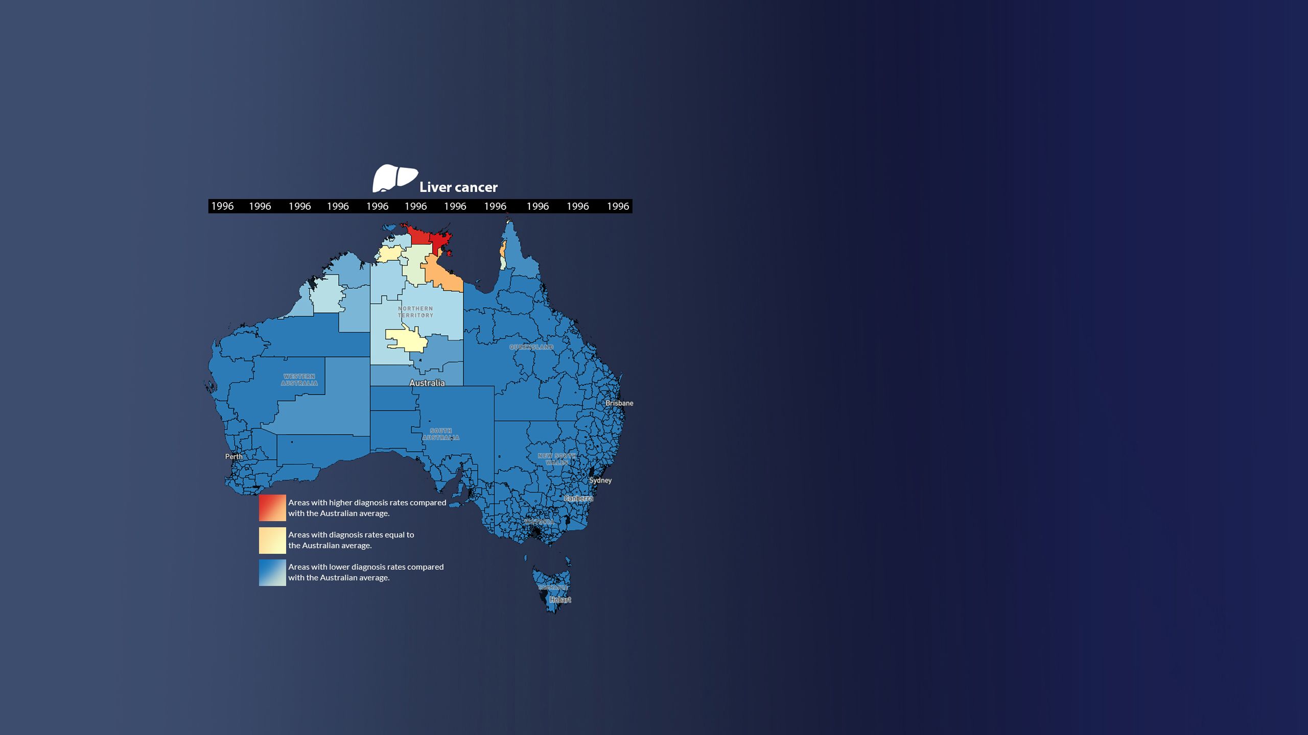
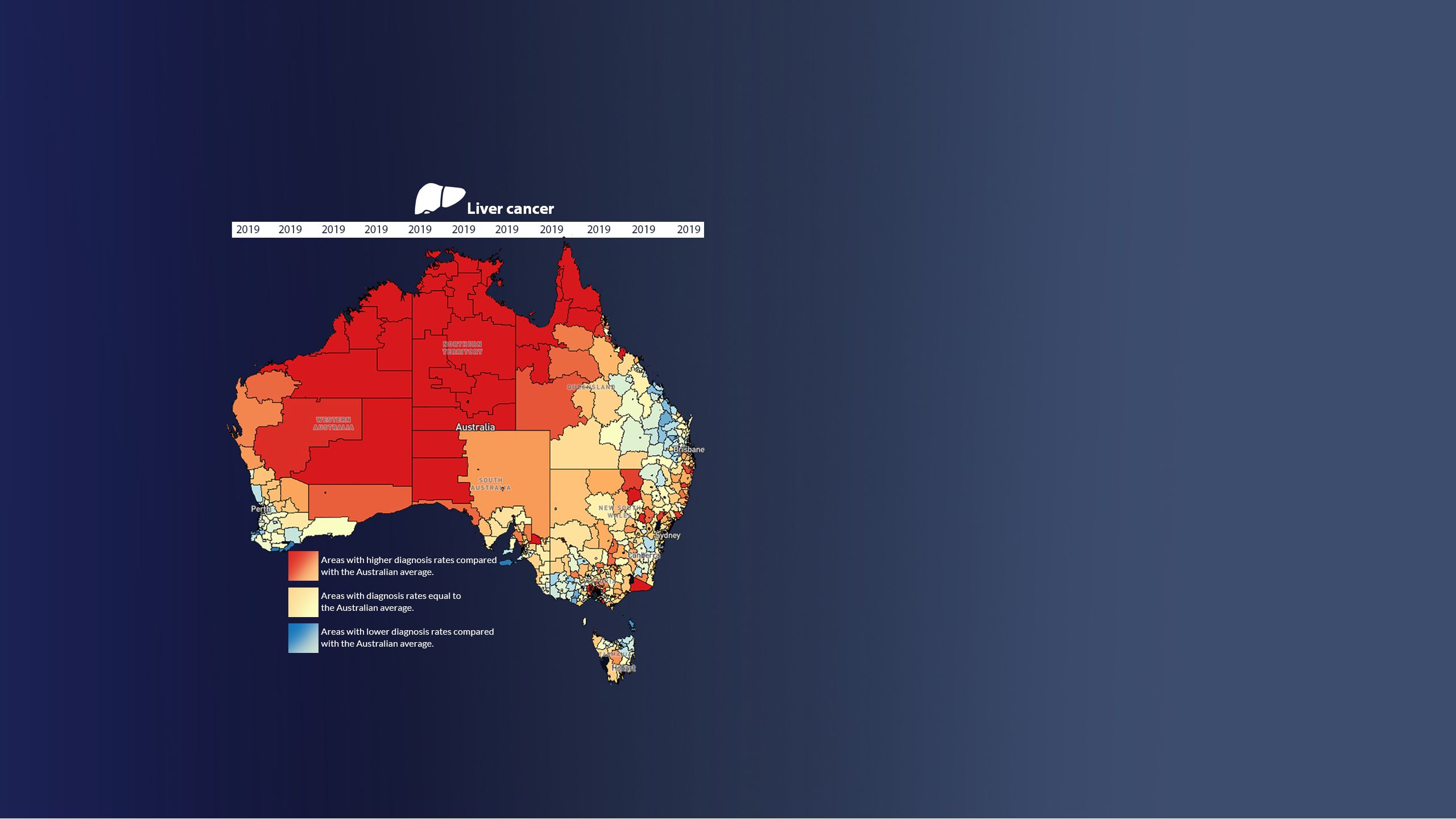
2. Liver cancer diagnosis rates are increasing.
The Atlas shows that liver cancer diagnosis rates are increasing nationally over time. This map shows the diagnosis rates of liver cancer in the year 1996. The corresponding map from 2019 (next page) shows the increase in liver cancer diagnoses.
Scroll down to see the difference between diagnosis rates in 1996 and 2019.
The diagnosis rates are consistently higher in Northern and Central Queensland (although absolute counts of diagnoses are fairly small), and parts of Sydney and Melbourne (where absolute numbers are higher). Survival is generally worse in areas outside the major cities, including in Sydney and Melbourne that have higher diagnosis rates but better than average survival.
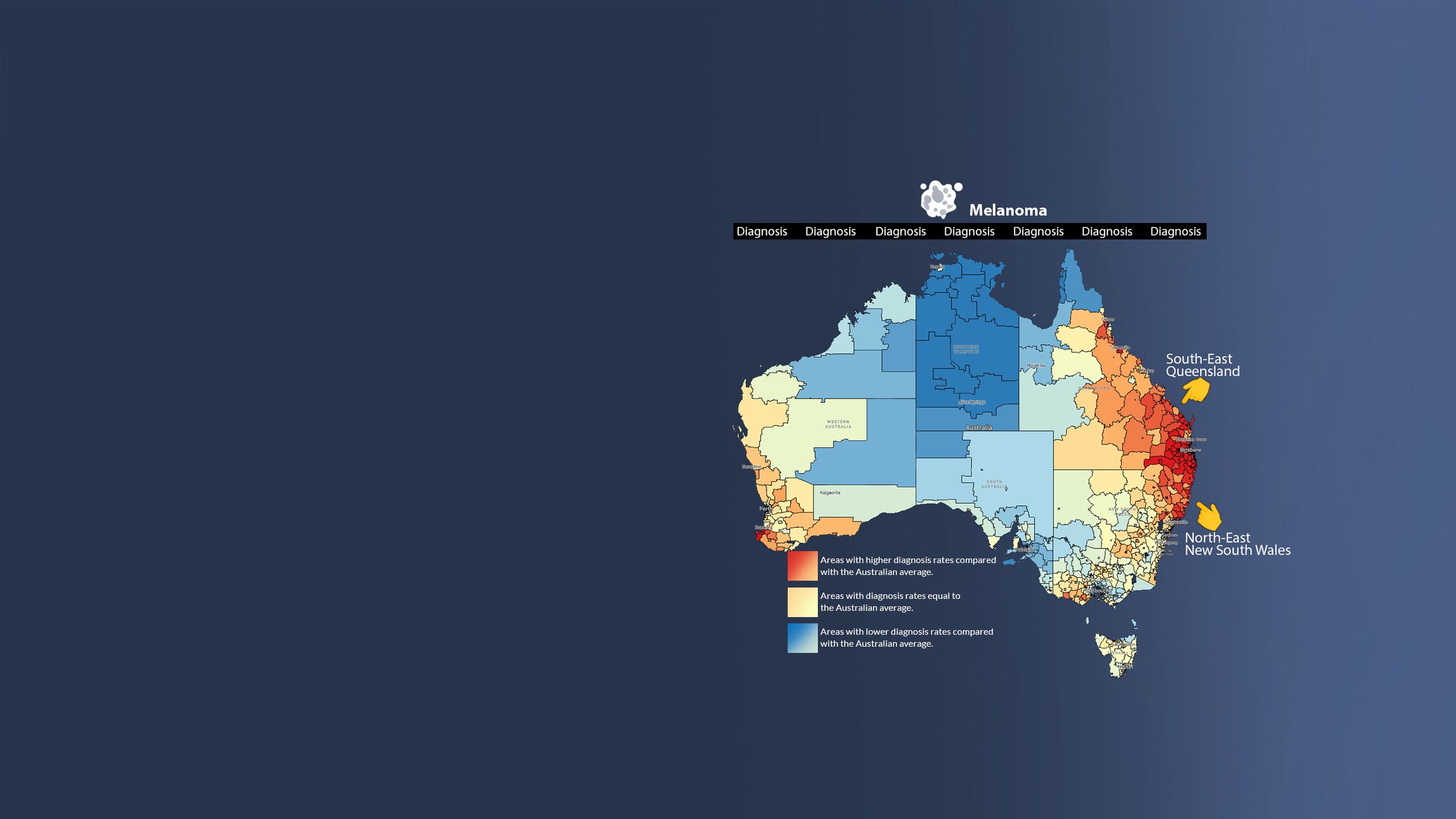
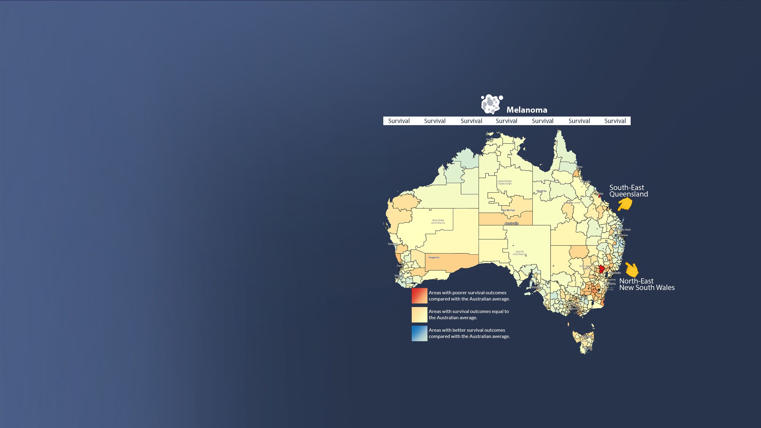
3. Melanoma rates are highest in South-East QLD and North-East NSW
The Atlas shows that melanoma diagnosis rates are highest in South-East Queensland and North-East New South Wales, and these patterns have largely remained unchanged over time.
Scroll down to see the survival rates.
Survival rates for melanoma are generally better in areas where diagnosis rates are higher than average.
Where can I get cancer information and support?
Cancer Council Queensland, along with the Cancer Councils across Australia, provide a free, confidential telephone support service available to everyone in the country to ensure nobody is left navigating cancer alone.
Australians impacted by cancer can call this free service to gain information about cancer, as well as emotional and practical support. Our 13 11 20 hotline can also refer callers to support programs and services in their local area.


How can I contribute to reducing the impact of cancer in Australia?
By donating to Cancer Council Queensland, you can support services like accommodation lodges and transport to treatment, which can make a significance difference in a person's cancer journey. Your donation can also contribute to cutting-edge research conducted at Cancer Council Queensland that aims to understand the underlying reasons for cancers. This research will save thousands Australian lives.

Creators of this visual explainer
Muhammad Haroon. Postdoctoral Fellow Communication Specialist, Cancer Council Queensland.
Project administration, Visualisation, Writing - original draft
Associate Professor Kate Thompson. Lead Digital Learning for Change, Queensland university of Technology.
Methodology, Supervision, Writing - review & editing and Funding acquisition
Jacinta Lisec. Research Associate, School of Teacher Education and Leadership, Queensland university of Technology.
Writing - original draft
Professor Peter Baade, Research Lead Cancer Epidemiology, Cancer Council Queensland.
Methodology, Supervision, Writing-review & editing, and Funding acquisition
Distinguished Professor Kerrie Mengersen, Director Centre for Data Science, Queensland University of Technology
Methodology, Funding acquisition
Contributors
Sarah Azad, Senior UX/UI Designer, VISER (Visualisation and Interactive Solutions for Engagement and Research), Queensland University of Technology
Conceptualisation
Thom Saunders. Principal Visualisation Specialist, VISER (Visualisation and Interactive Solutions for Engagement and Research), Queensland University of Technology
Conceptualisation
Dr. Jessica Cameron, Senior Research Fellow, Modelling and Epidemiology, Cancer Council Queensland
Conceptualisation
Associate Professor Suzanna Cramb. Principal Research Fellow, Australian Centre for Health Services Innovation, Queensland University of Technology
Conceptualisation

